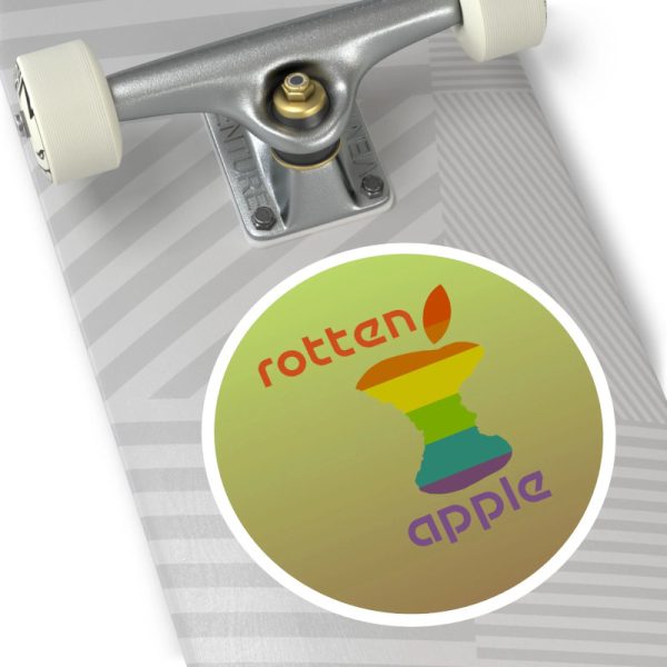
Rotten Apple
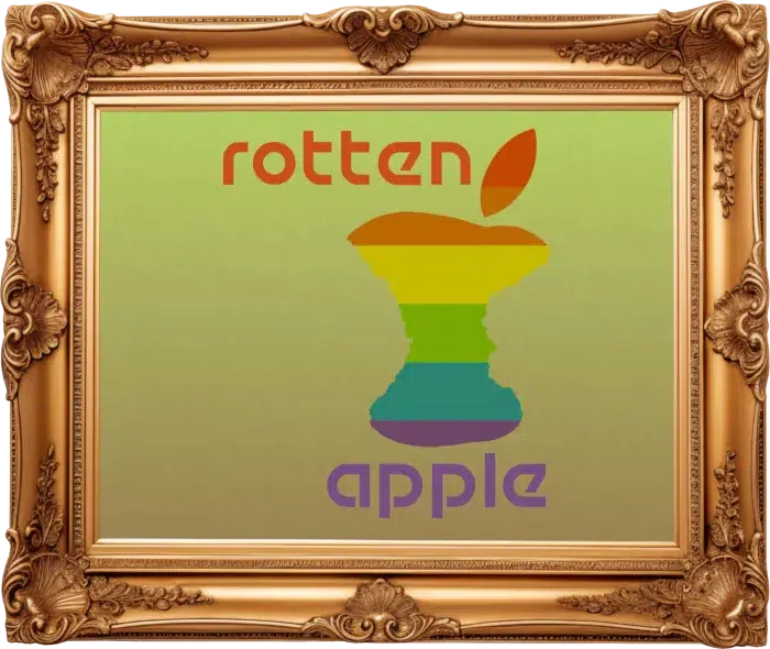
Click here or on the image see this piece at huge scale. The huge image is watermarked for copyright protection so you can right click on it if you’re on desktop or tap & save it on mobile devices to see the details up close. You’re welcome!
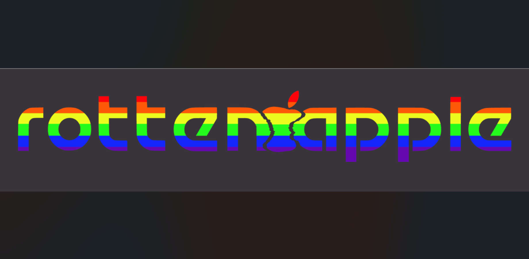
Rotten Apple. I was reading at the time I made this piece in 2020 and finished it in 2022 about how Apple sends all your phone data to China to be placed in databases.
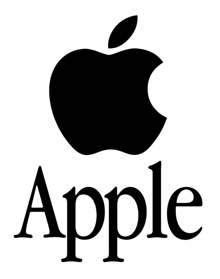
Here’s a logo that Apple currently uses. I also don’t like Apple because its like Microsoft where they keep all their software proprietary where you don’t know whats going on behind the scenes in the code as its not open source.
Here is the most current logo used by Apple:
I was less inspired by the new Apple than the old one I used to use in elementary school, the Apple IIe in the 1980’s.
The two games I remember using on it were Oregon Trail and Number Munchers.
Number Munchers I credit with giving me a lot of skills in mathematics as it had all kinds of levels where you could learn to do math quickly. It was a game, so being into Nintendo when that came out and Game Boy later, it made learning fun.
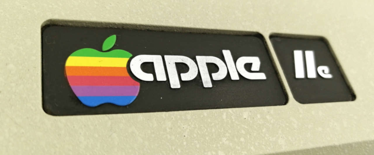
Here’s that logo that I used for the new logo. It had a rainbow on it and I liked the font it used better than the new one.
That device was old school and had 5 1/4″ floppy drives. Your smart phone today probably has like 100,000 times more computing power and hard drive space than this whole machine.
Here is what the Apple IIe logo looked like that was the inspiration for Rotten Apple:
I was eating a really good Pink Lady apple one day in Modesto and decided to photograph it before I ate through the middle of it to eat the seeds.
Here’s the actual photo of the apple I used:
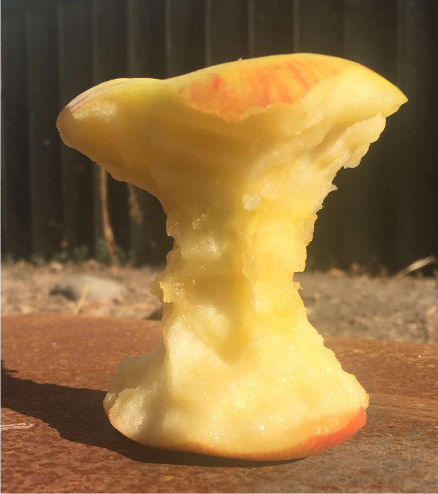
Rotten apple inspiration apple, circa 2020
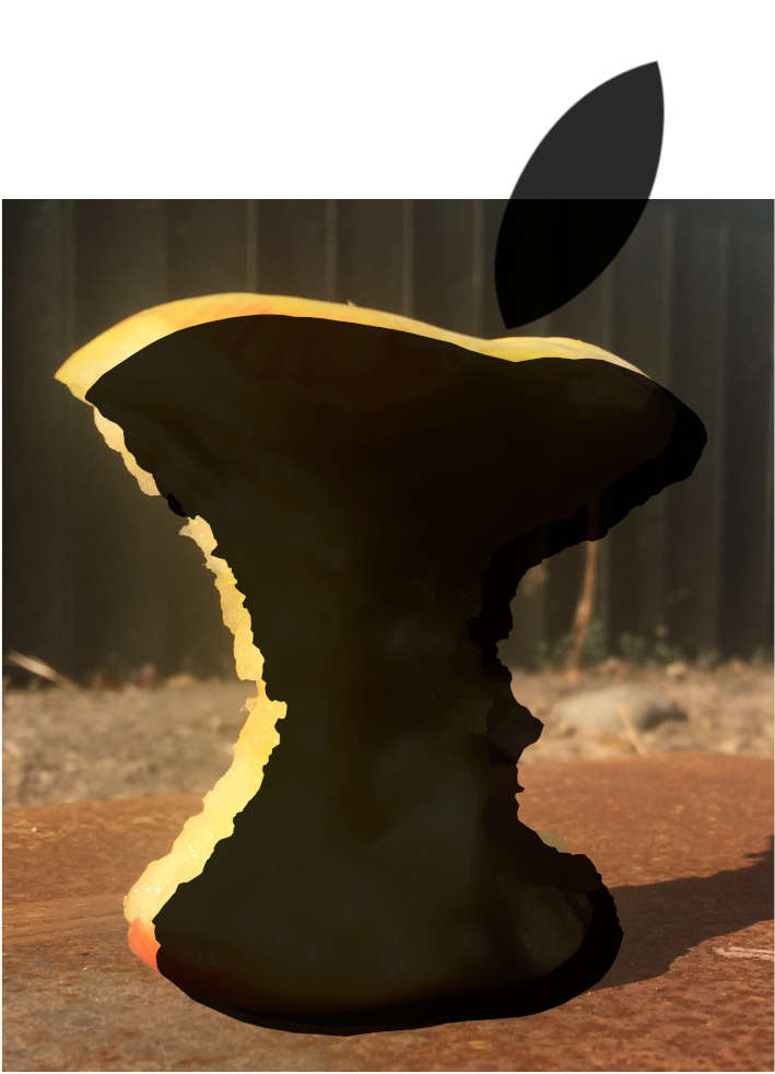
Rotten apple inspiration apple, w/ Inkscape trace overlay, circa 2020
I made a 3D model of an eye device, but it didn’t match with my intent for this design with Rotten Apple.
The last image was putting all the colored lines across the type, but didn’t work for me from a design perspective and really didn’t look as good as the final design in my estimation.
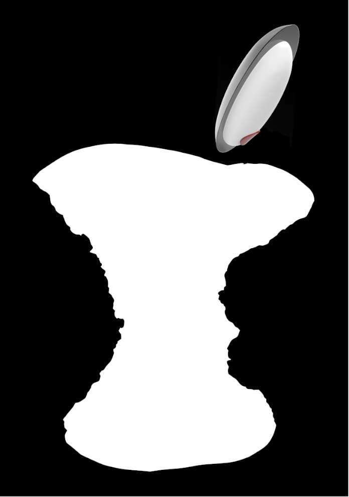
Rejected Rotten Apple design, w/ Blender eye, circa 2021
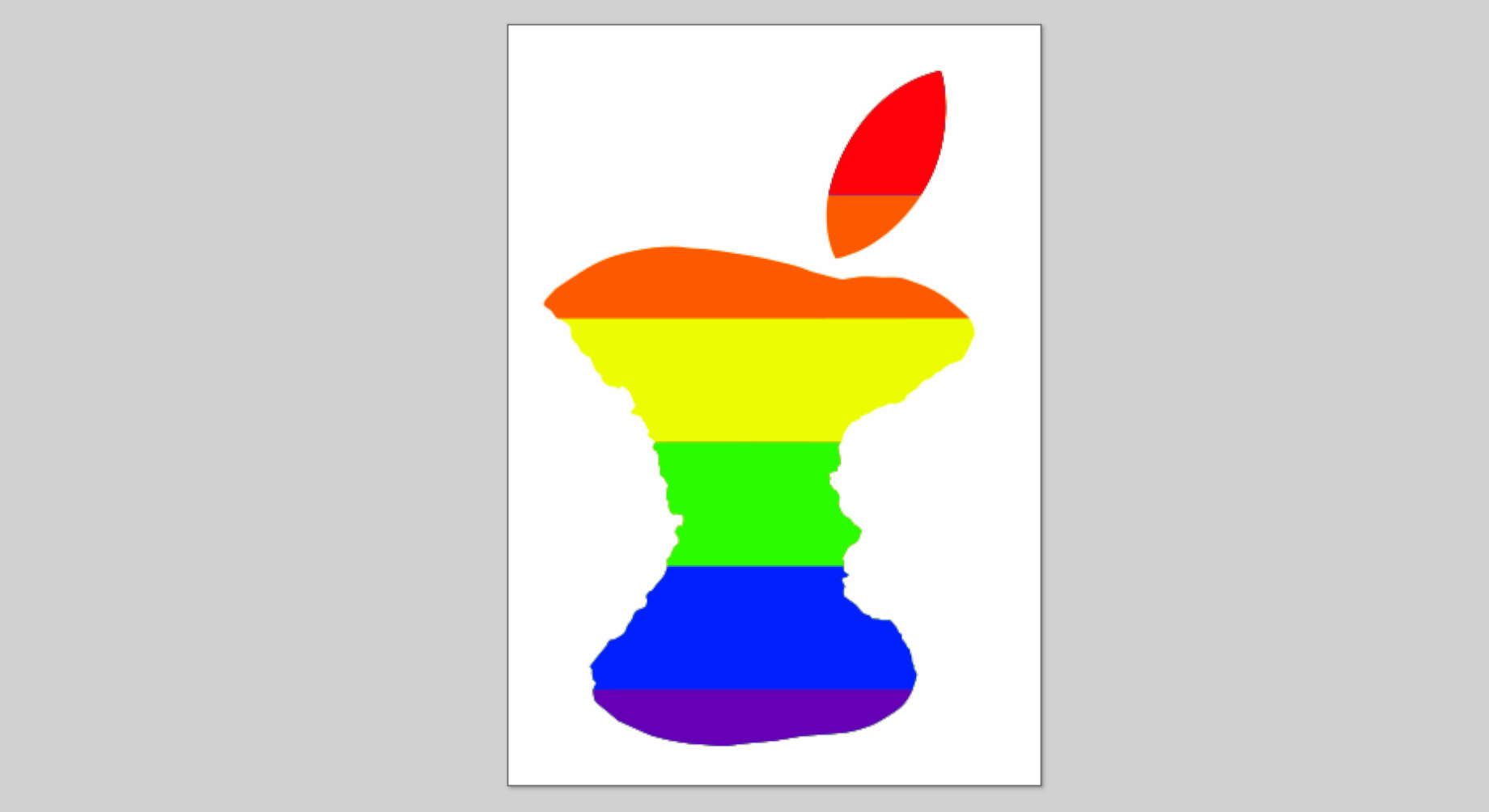
Rotten Apple base apple design, before color change, circa 2021
Rejected Rotten Apple design, w/ apple and type on same line, circa 2021
So, I took the apple design from the second photo above and instead placed the Apple IIe typeface font above and below the apple and it worked better for me.
The problem I had with the design, was how to get the type to look correct. I finally messed around with it enough and placed the ‘rotten’ text to the right of the eye stem of the apple and it worked great.
So, that’s the story of Rotten Apple…